Wakesurf Tampa
An 18-page charter site rebuilt as seven focused pages with a new identity. The new site launches next week.
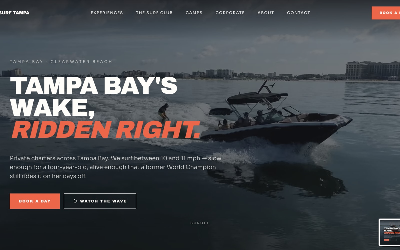
Same boat. Different business.
New site — launching soon
A boat business that had outgrown its website.
Spence and Adriane run one of the most established wakesurf operations on Tampa Bay. The boat, the crew, the experience on the water — all of it was current. The website was not. It had been up for more than five years, and it showed.
They knew it. What they didn't have was the time to fix it. Running charters through a Florida season leaves very little room for rebuilding a website from scratch, and the ambition was bigger than a refresh anyway: they wanted to be the name people think of first when they search for wakesurfing in Tampa. That takes a site that looks like the market leader, not one that looks like it was built once and never touched again.
The site wasn't failing. It was just standing still.
The audit turned up the usual accumulation of a site nobody had time to maintain: eighteen pages of content that had grown by addition rather than design, thin and duplicated page titles, no coherent internal structure, and details that had quietly gone out of date — including staff who had long since moved on.
None of it was catastrophic on its own. Together it meant the site was working against the business: hard to navigate, slow to get anyone to a booking, and giving search engines very little reason to rank it above competitors who had put in the work.
Modern enough to lead. Familiar enough to belong.
Wakesurfing has a culture, and that culture has a look — sun, saltwater, a bit of nostalgia. A brand that ignores it reads as an outsider. A brand that leans too hard into it reads as a costume.
The direction sits between the two: contemporary structure, vintage warmth. Sunset Coral and Bay Teal carry the coastal feel without becoming a beach cliché. Archivo Black gives the headlines the confidence of a market leader — heavy, unapologetic, impossible to mistake for a template. Sora keeps everything underneath it calm and readable.
The result belongs on the water and still looks like a business worth booking.
Eighteen pages became seven.
The old site asked visitors to find their own way. The new one has a single job: get someone from "this looks good" to "I've booked" with as little friction as possible.
That meant cutting hard. Seven pages, each with one clear purpose, each with an obvious next step. Nothing that exists only because it existed before. The booking path is visible from every screen, and no page leaves a visitor wondering where to go next.
Less to maintain, less to navigate, and a much shorter distance between interest and a confirmed charter.
Keep reading.

Ready to look like the best in your market?
Tell me about your business and what the current site isn't doing. I read every inquiry myself and reply within one business day — with an honest answer about whether I'm the right fit.
- Fixed price
- No hourly billing
- Reply within 1 business day
- Honest no if it's not a fit